
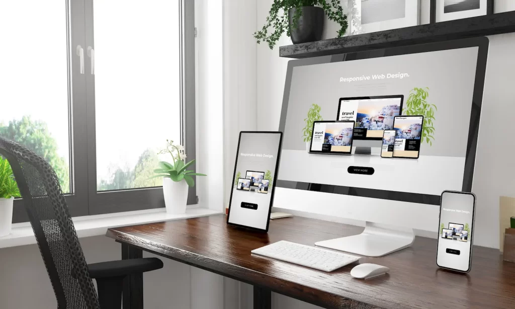
Responsive design is not optional, it is essential for your website!
More than 50% of global web traffic comes from mobile devices. If your website isn't optimized to display correctly on mobile devices and tablets, you're losing customers, Google rankings, and credibility. Responsive design is the solution.
A responsive website is when a page automatically adapts to any screen size, ensuring that navigation is easy, content is readable, and the user experience is fluid on any device. Think from a very large screen to a small smartphone.
In this article we will talk a little about what responsive design is, why it is very important for your business and how to implement it correctly.
What is responsive design?
Responsive design is a web design technique that allows a web page to automatically adapt to different devices and screen sizes. It uses flexible CSS, media queries, and fluid layouts to ensure an optimal user experience on any device. If you're using a visual builder like Elementor, Divi, or Beaver Builder, remember to design for the three most common sizes (smartphone, tablet, and desktop).
Key Features of Responsive Design
- Using media queries: They allow you to modify the layout based on the screen size.
- Flexible images: They automatically resize to fit different devices.
- Proportion-based design: Relative units such as “em” and “%” are used instead of “px”.
- Optimized navigation: Adaptive menus and easy-to-access buttons on touch screens.
Why is responsive design important for your business?
1. Improve user experience (UX)
A responsive site offers a fluid experience, without the need for zooming or horizontal scrolling. This reduces friction and increases user satisfaction.
2. Increase conversion rate
When users can navigate without difficulty, they are more likely to take a desired action, such as purchasing a product or completing a contact form.
3. Improve your positioning on Google (SEO)
Google prioritizes responsive websites in its search results. A mobile-friendly design improves your ranking and attracts more organic traffic.
4. Reduce maintenance costs
Instead of developing a separate version for mobile and another for desktop, a responsive design allows you to manage a single website.
5. Adapts to the future of the internet
New devices with different screen sizes keep appearing. A responsive design ensures that your site will be ready for any future technology.
How to implement responsive design?
1. Use a responsive design framework
Frameworks like Bootstrap or Tailwind CSSmake it easy to create flexible layouts without starting from scratch.
2. Apply media queries in CSS
Code example:
@media (max-width: 768px) {
 body {
 font-size: 16px;
 }
}
This changes the font size when the screen is smaller than 768px.
3. Optimize images and multimedia elements
Use images in modern formats like WebP and define srcset attributes to load the best version for each device.
4. Test on different devices
Tools like Google Mobile-Friendly Test or “Chrome Developer Tools” help you verify if your site is truly responsive.
Frequently Asked Questions about Responsive Web Design
How do I know if my website is responsive?
You can test your site with tools like Google Mobile-Friendly Test or resize your browser window and see if elements fit properly.
What is the difference between responsive design and adaptive design?
- Responsive: Uses a single flexible design that adjusts to any screen.
- Adaptive: Loads different predefined layouts depending on the detected device.
Is it mandatory to have a responsive design?
It's not mandatory, but highly recommended. Google penalizes sites that are not optimized for mobile, and users expect a good experience on any device. Consider that today, more than 50% of the traffic you'll receive on your website will come from mobile devices, so make an effort to give them a good experience as well.
How much does it cost to make a responsive website?
The cost varies depending on the complexity of the site and the platform used. If you're using WordPress, there are free and premium responsive themes that can help. If you're thinking of using a visual builder like Elementor, remember to create layouts for the three resolutions that this tool gives you by default.
What are common mistakes in responsive design?
Some common mistakes include:
- Images that are too large make your website load slower.
- Small buttons that are difficult to tap on touchscreens, keep in mind that no “clickable” element should be smaller than 50px in diameter.
- Do not test on different browsers and devices, it is important that you test the design of your website on at least 5 different devices, test on Android and iOS mobile phones in different browsers, check on a tablet and on computers with different screen resolutions.
Conclusion
Responsive design is not just a trend, it is an essential requirement for any modern website. A responsive site improves user experience, boosts SEO and reduces maintenance costs.
If your website isn't responsive yet, now is the time to update it. At Source Code, we are experts in web design and development. If you need help making your site responsive, contact us today!